
Designing for the next billion users is more than a market opportunity. It is a chance to bring technology to people who are experiencing it for the first time. When I started working on this challenge, I realized that every design decision could either open a door or create a barrier. The responsibility was huge, and it shaped how I approached every step of the process.
This work taught me that design is not just about screens or interfaces. It is about trust, clarity, and respect for the user’s context. It is about creating experiences that work for people who may have never seen a digital product before. And it is about doing so in a way that feels natural and empowering.
Who We Designed For
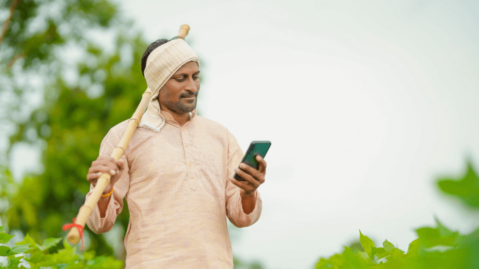
Our audience came from rural towns, tier 2 and tier 3 cities, and families sharing a single device. Many were first time smartphone users. Internet packs were limited, and data speeds could drop at any time. English was rarely the preferred language.
Understanding the Context
We began with field visits, observing how people used their phones. Some kept their devices in plastic covers to protect them from dust and rain. Others had limited storage space, so apps had to be light. People often relied on voice calls and missed notifications because data was turned off most of the day. These observations shaped every design decision.
Mobile First Approach
Since mobile was the only gateway to the internet, we designed everything for small screens first. Buttons had to be big enough to tap easily. Fonts had to be readable outdoors in bright sunlight. Actions had to be possible with one hand because many users worked while holding something in the other.
Cultural Sensitivity
Colors, symbols, and words mattered. We avoided icons that required prior app experience. For example, a hamburger menu icon was often missed, so we used visible navigation bars. We used local currency, local units of measure, and examples that felt familiar. Did the app feel like it was built for them? That question guided every design choice.
Principles That Guided Every Screen
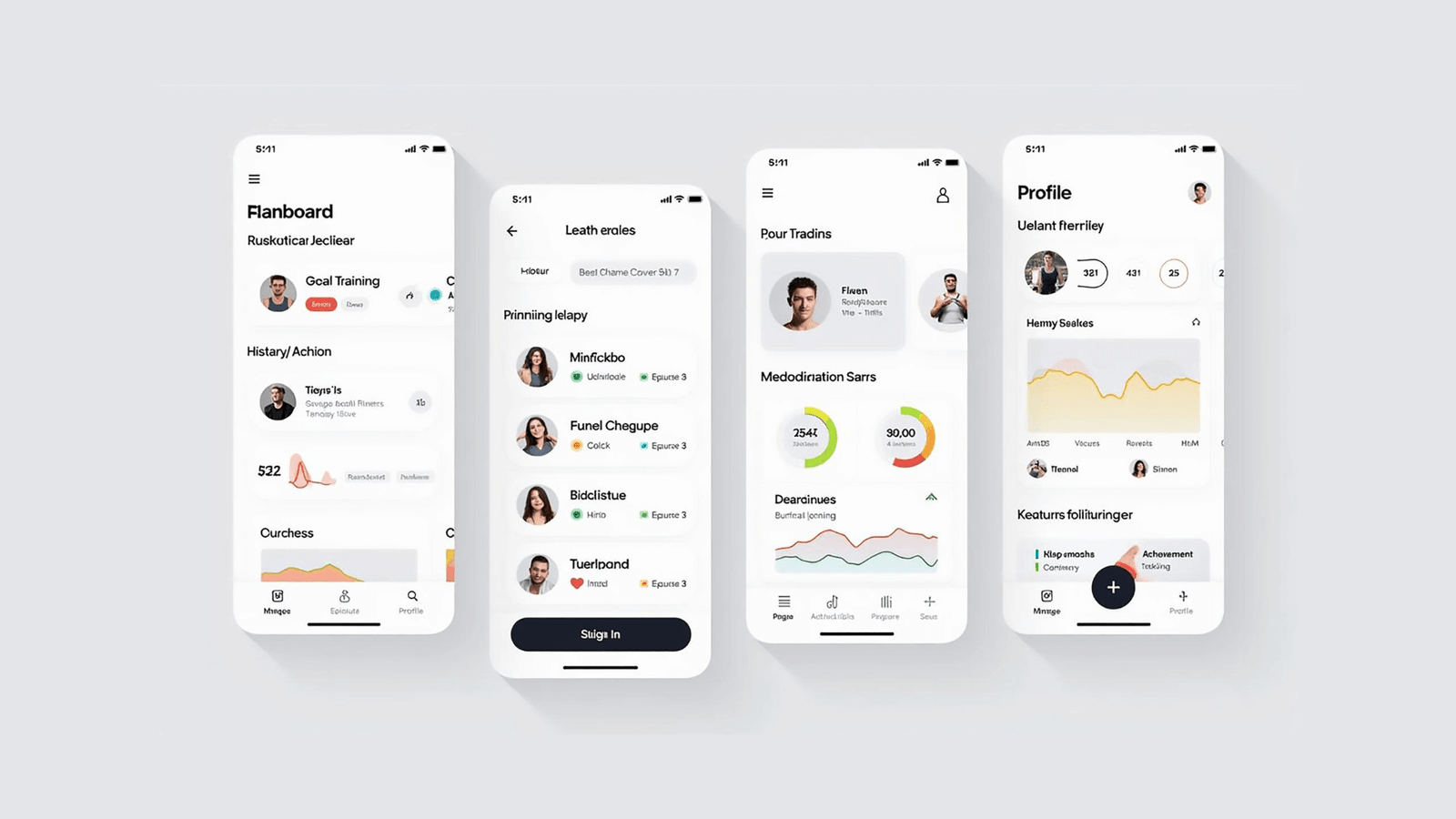
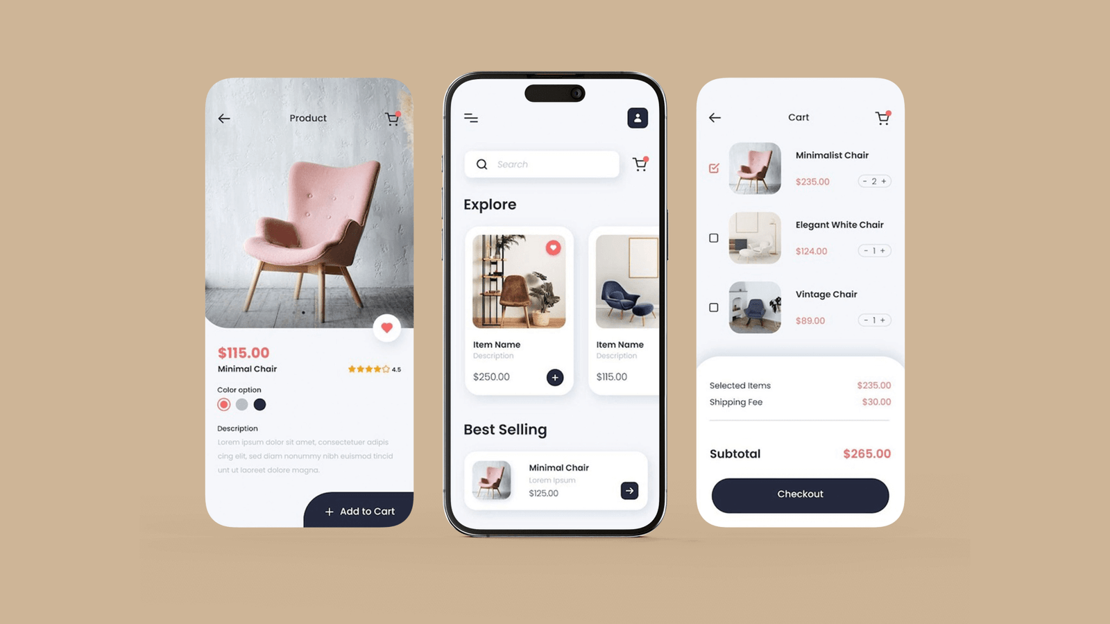
Keep It Simple
Each screen had one clear purpose. We removed anything that distracted from the main action. Typing was kept to a minimum, with data auto detected where possible. For example, if we could pre fill a phone number from the SIM, we did it.
Build Trust
Trust was the most important design goal. We added confirmation screens after key actions, success messages that were clear and visual, and error states that explained exactly what went wrong. A green checkmark with the words “Saved successfully” did more for confidence than any onboarding tutorial.
Be Inclusive
We supported multiple languages and tested the tone of every message. We chose words that were familiar and friendly. We used icons and illustrations that could be understood without reading, so even users with low literacy could navigate with ease.
Designing for Real World Constraints
Low Bandwidth and Device Limitations
Our app had to work on low end phones with limited RAM. We optimized every image, removed unnecessary animations, and made sure screens loaded fast. The entire app had to stay small enough to fit comfortably on devices with little free space.
Offline Support
Connectivity was unreliable, so we built offline first. Users could complete tasks even when the network was down, and data would sync later. We added clear indicators showing whether something was saved locally or uploaded. This removed anxiety and reduced support calls.
Power and Battery Constraints
Some users only charged phones once a day or even every two days. We avoided power hungry features, reduced background refresh, and made sure the app did not drain the battery unnecessarily.
Research and Testing Process
Field Research
We did not guess. We watched real users in their environment. We saw where they hesitated, where they smiled, and where they got stuck. These insights gave us a clear view of what mattered.
Usability Testing
We ran short sessions where users tried to complete real tasks. We measured how long they took, where they tapped first, and what confused them. If someone had to ask for help, we considered that a design failure and fixed it.
Iteration and Continuous Learning
We never assumed we got it right on the first try. Every sprint included small design changes based on feedback. We simplified flows, improved button placement, and rewrote microcopy until it felt natural. Over time, the app became smoother and required less explanation.
Small Details That Made a Big Difference
- A green checkmark after saving reduced drop offs and follow up calls.
- Full width action buttons improved completion rates by more than 30 percent in some flows.
- Showing last synced time built confidence even when the network was slow.
- Illustrations of people in familiar clothing made the interface feel approachable.
- Inline error hints helped users recover without restarting the task.
Outcomes and Measurable Impact
The results were clear. People completed transactions with fewer errors. First time users were able to finish sign up without external help. Support tickets related to “Did it go through?” dropped significantly after we improved confirmation states. Even users on low end devices reported that the app felt fast and reliable.
For the team, this approach reduced rework and made development faster. Engineers had fewer late changes because we caught usability issues early. PMs had more confidence in planning because they could see which features worked in the field.
What Surprised Me Most
I expected language to be the hardest problem, but it was not. Most users could work through partial English if the interface was clear. What mattered more was trust and reassurance. People wanted to know their action worked. They wanted proof their data was safe. Adding small confirmations and clear progress indicators had the biggest impact on confidence.
Another surprise was how much users relied on visual cues. A small color change or a missing icon could stop them completely. This taught me to never underestimate the power of visual design in guiding behavior.
Closing Thoughts
Designing for the next billion users is not just about scale. It is about inclusion, empathy, and respect. When you remove friction for a first time user, you make the experience better for everyone. This project reminded me why I became a designer. It showed me that good design is invisible, builds confidence, and lets people focus on what they want to achieve. Isn’t that what good design is supposed to do?