Simplifying enterprise security workflows so different teams can act with clarity and confidence
Context
This project focused on improving the security experience in a complex enterprise system used to manage sensitive configurations, access controls, and data protection policies.
The system was powerful, but the experience did not match its complexity. Users across different roles had to make critical decisions without clear understanding of impact, which created risk, hesitation, and inefficiency.
The goal was not to reduce functionality, but to make the system easier to understand, safer to use, and more reliable for decision-making.
Target Audience and Personas
The system was used by multiple enterprise roles, each with different goals:
Security Administrator (Primary User)
- Manages policies, keys, and configurations daily
- Needs control and clarity
- Struggles with understanding impact of changes
Compliance / Risk Officer
- Reviews logs, audits configurations
- Needs clear visibility and proof
- Struggles with scattered and hard-to-verify data
DevOps / Platform Engineer
- Integrates system into workflows
- Needs speed and simplicity
- Struggles with complex setup and unclear flows
Enterprise Architect
- Evaluates system at a high level
- Needs system clarity and structure
- Struggles with too much low-level detail
Key Tension
- Control vs simplicity
- Audit vs speed
- Power vs usability
The experience had to support all users without making the system overwhelming or restrictive.

The Challenge
The existing system created friction at multiple levels:
- Too many configuration options without clear grouping
- No clear guidance for decision-making
- High cognitive load across flows
- Inconsistent patterns across modules
This resulted in:
- Users hesitating before taking action
- Increased chances of errors
- Dependency on support or documentation
The core issue was not complexity. It was lack of clarity in how the system communicates decisions.
My Contribution
- Led the design effort to improve security experience across the system
- Defined a clear direction to simplify decision-making without reducing capability
- Guided the team in structuring flows and interactions
- Contributed directly to research, flows, and high-fidelity designs
- Worked closely with product and engineering to align usability with security requirements
What Process We Followed
Step 1: Understand real user behavior
- Analyzed how different roles interact with the system
- Identified where users hesitate, make errors, or need support
- Mapped key decision points across workflows
Step 2: Structure for clarity
- Grouped related configurations logically
- Reduced unnecessary options at each step
- Defined clear hierarchy of information
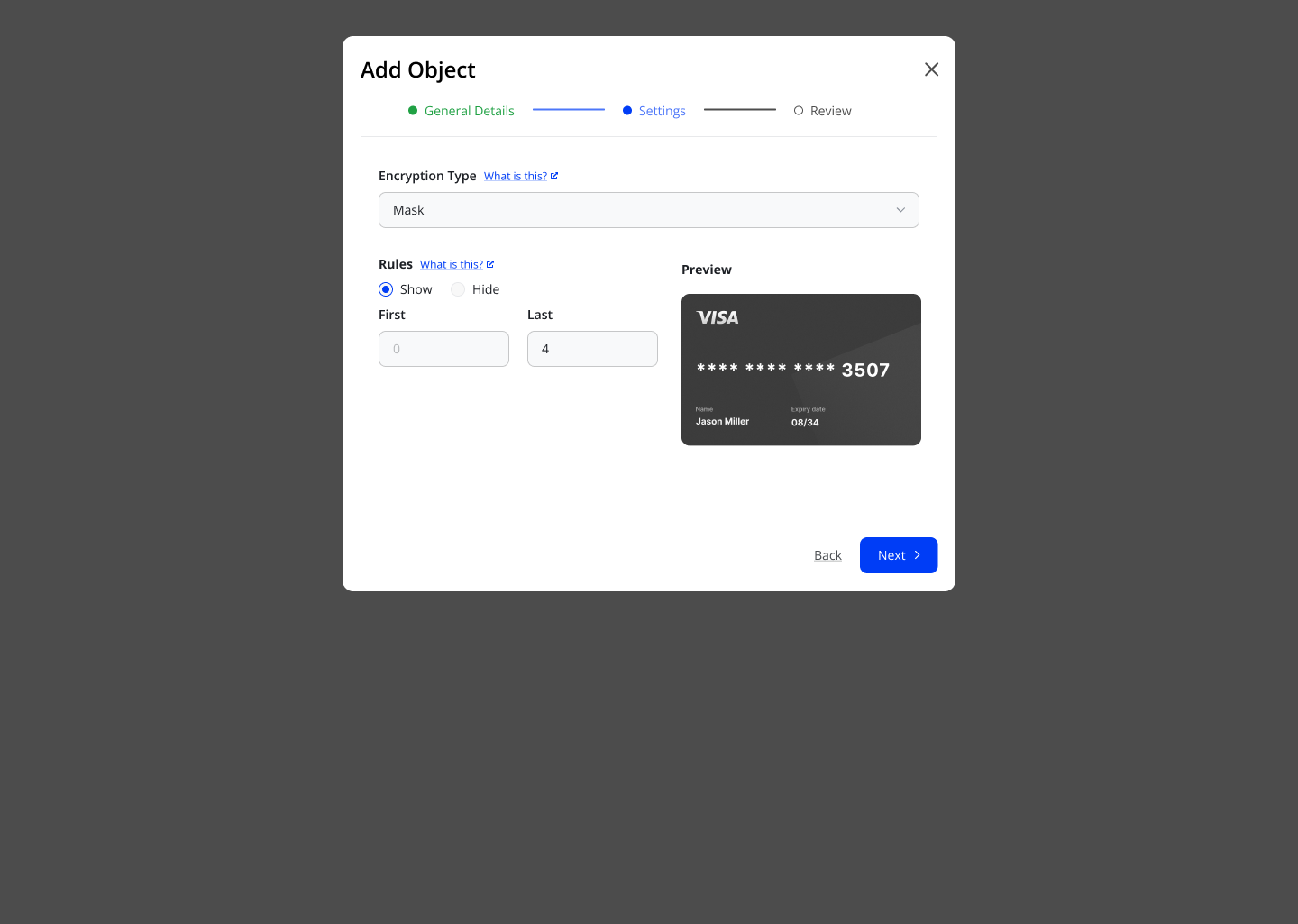
Step 3: Simplify decision points
- Broke complex flows into smaller steps
- Made each action easier to understand
- Added clear labels and contextual explanations
Step 4: Standardize experience
- Introduced consistent interaction patterns
- Aligned flows across modules
- Reduced need for relearning between sections
Step 5: Iterate and refine
- Tested flows with real scenarios
- Improved clarity based on feedback
- Focused on reducing cognitive effort at every step
Key Decisions and Trade-offs
- Reduced visible complexity instead of exposing full system depth
- Prioritized clarity in first interaction over showing all options
- Balanced flexibility with structured guidance
- Chose consistency over customization in early stages
These decisions helped make the system usable without limiting its power.
Collaboration
- Worked with product teams to define clear user journeys
- Partnered with engineering to ensure feasibility
- Used real user issues to drive alignment
- Helped shift discussions from features to user understanding
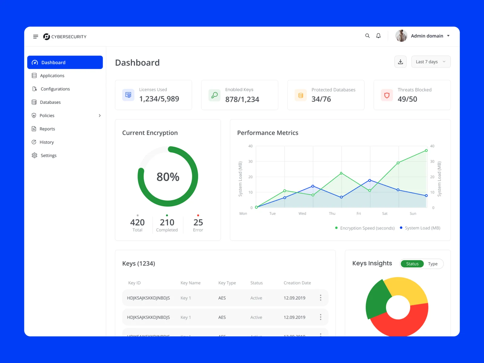
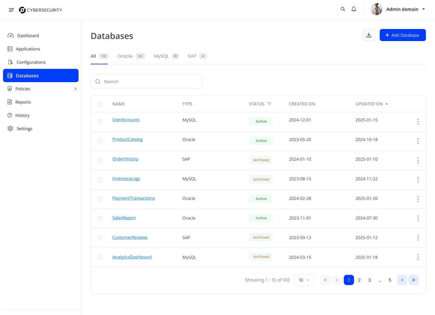
Solution Overview
The improved experience focused on clarity and predictability:
- Structured workflows for critical actions
- Clear grouping of configurations
- Contextual guidance for decision-making
- Consistent interaction patterns across system
- Reduced visual and cognitive load
The system now supports users in understanding what they are doing before they act.
Outcome
- Users could complete tasks with less hesitation
- Reduced dependency on support and documentation
- Improved confidence in making security decisions
- More consistent experience across roles and workflows
Reflections
- Enterprise systems fail when users do not understand them
- Clarity is more important than reducing features
- Good security experience builds confidence, not just protection
Key Takeaway
- Users do not avoid complex systems.
- They avoid systems they do not understand.
- Designing for clarity is what turns complexity into confidence.