Making complex financial data easier to read, trust, and act on
Context
This project focused on improving a crypto dashboard used to track assets, understand trends, and make buy or sell decisions.
The product had rich data and powerful tools, but the experience felt heavy. Users had to work hard to understand what the data meant before taking action.
The goal was to make the dashboard clear, reduce effort, and help users make decisions with confidence.
Target Audience and Personas
Beginner Investor (Primary User)
- New to crypto
- Needs simple views and clear explanations
- Struggles with charts and technical terms
Active Trader
- Checks data frequently
- Needs quick insights and fast actions
- Struggles when information is cluttered
Long-term Investor
- Tracks performance over time
- Needs clear trends and summaries
- Struggles when data is hard to compare
Key Tension
- Simplicity vs depth of data
- Speed vs accuracy
- Guidance vs control
All users need one thing: clear data they can trust to make decisions.
The Challenge
The existing dashboard created confusion:
- Too much data shown at once
- Charts were hard to read
- Important signals were buried
- No clear guidance on what to look at next
This led to:
- Decision hesitation
- Misinterpretation of data
- Low confidence in actions
The core problem was not lack of data. It was lack of clarity.
My Contribution
- Took ownership of improving the dashboard experience
- Defined a clear structure for presenting data
- Simplified how users read and act on information
- Worked closely with product and engineering to align data, visuals, and interactions
- Contributed to research, flows, and high-fidelity designs
What Process We Followed
Understanding the Problem
- Reviewed how users read charts and metrics
- Identified where users get confused or misread trends
- Mapped key decisions users try to make on the dashboard
Structuring the Solution
- Organized data into clear sections
- Brought key metrics to the top
- Reduced noise from secondary information
Refining the Experience
- Simplified charts to highlight trends
- Improved labels and legends
- Added light guidance to explain key data points
Key Decisions and Trade-offs
- Reduced visible data to improve clarity
- Prioritized key insights over full detail in the first view
- Used progressive disclosure for advanced information
- Balanced guidance with user control
These decisions helped users understand faster without losing depth.
Collaboration
- Worked with product to define key metrics and priorities
- Partnered with engineering to align data accuracy and performance
- Used user feedback to refine charts and layouts
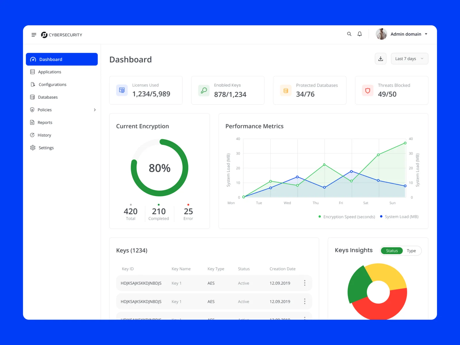
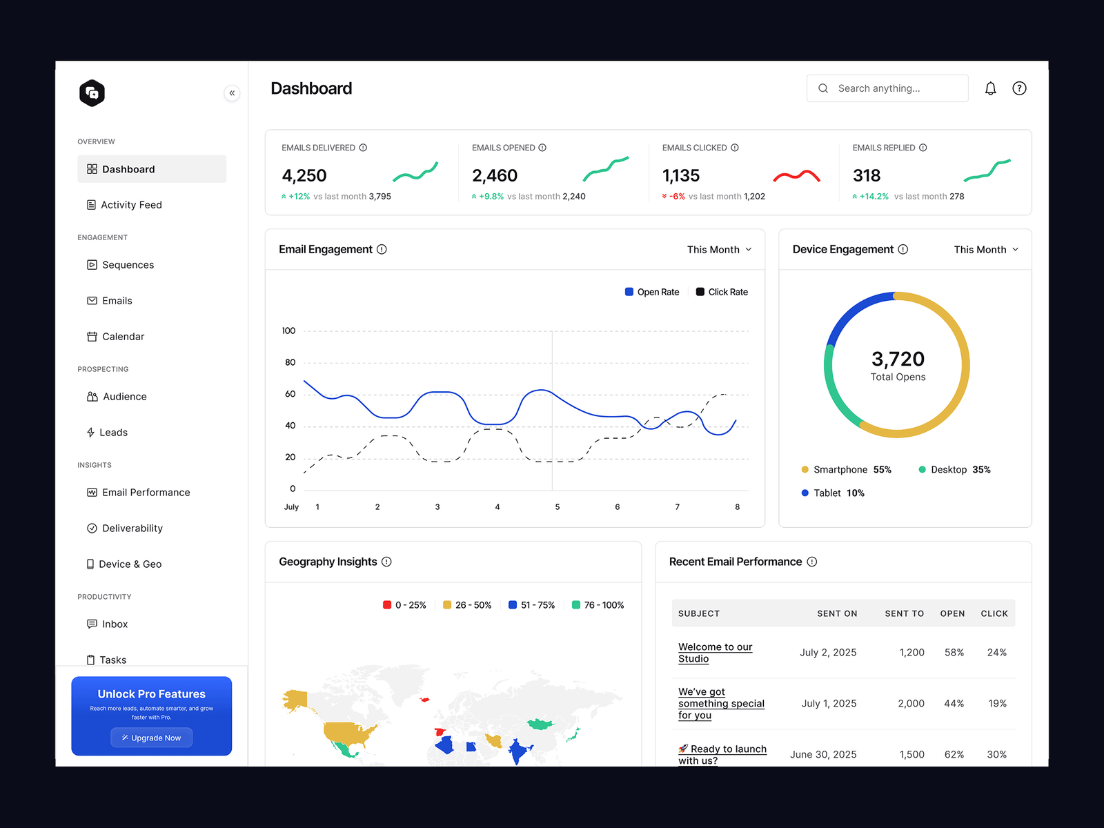
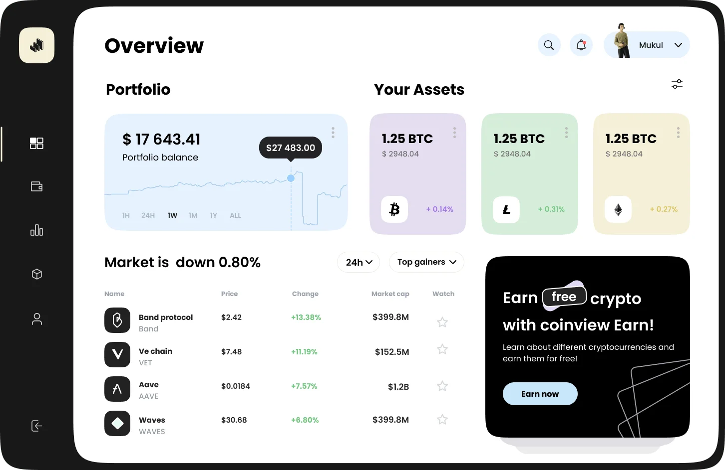
Solution Overview
- Clear dashboard layout with key metrics first
- Simplified charts focused on trends
- Clean grouping of related data
- Light guidance to support understanding
- Consistent patterns across views
The experience now helps users understand what is happening before they act.
Outcome
- Faster understanding of market trends
- Reduced confusion while reading data
- Higher confidence in decisions
- Better engagement with dashboard features
Reflections
- Data-heavy products need strong hierarchy, not more data
- Good charts reduce thinking effort
- Clarity is what builds confidence in financial decisions
Key Takeaway
- Users do not need more data.
- They need help understanding the data they already have.