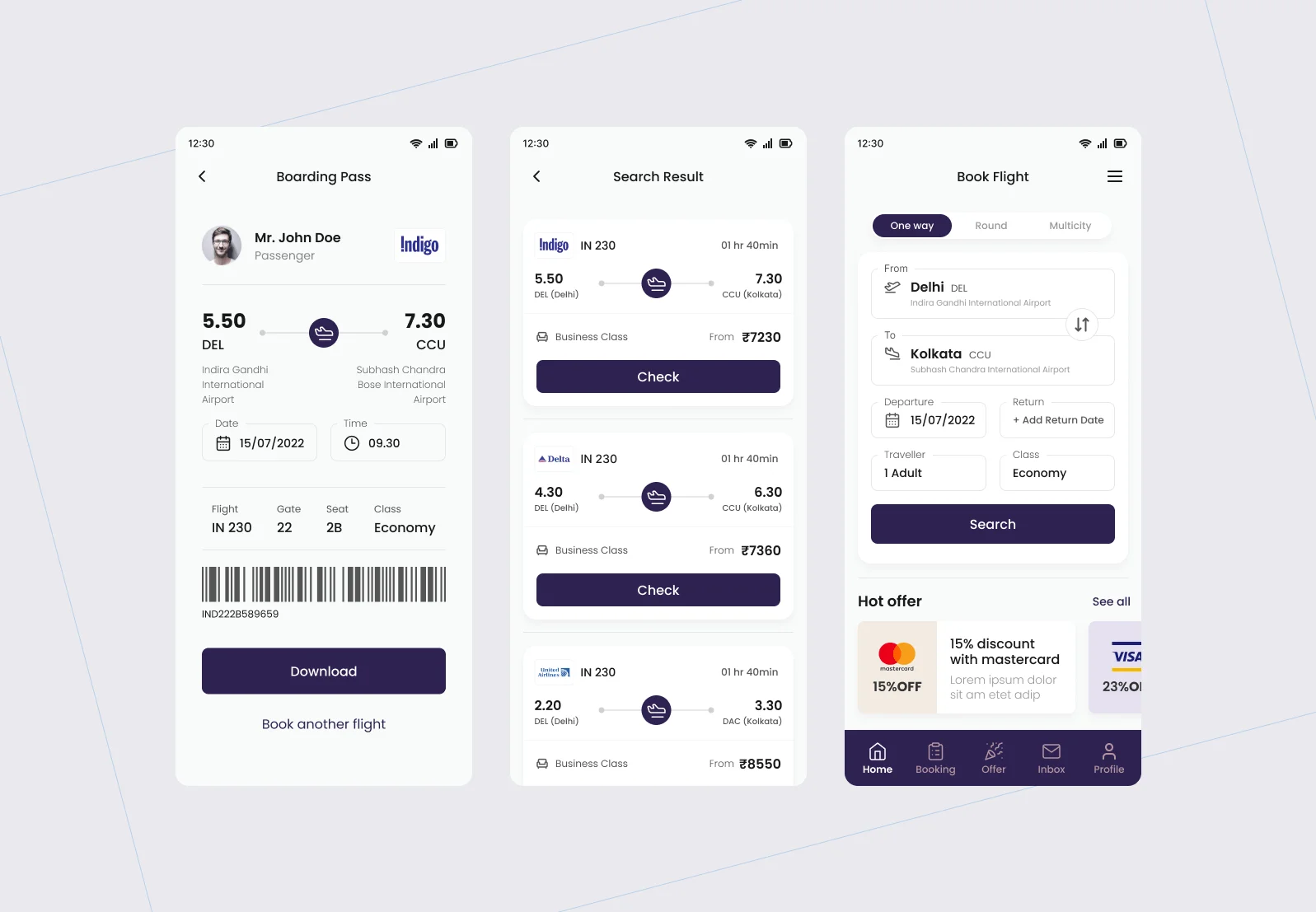
Simplifying search, comparison, and booking into a clear and intuitive flow
This project focused on improving the flight booking experience in a mobile-first travel platform.
The feature sits at the core of the product: helping users search, compare, and book flights efficiently in a high-pressure, decision-heavy environment.
The Problem
Flight booking platforms often create friction across the journey.
From analysis and research, key issues were:
- Too many steps in the booking process
- Confusing comparison across flights and dates
- Hidden pricing reducing trust
- High drop-offs during checkout
As highlighted in the case study, users struggled with complex workflows and unclear pricing, leading to abandoned bookings fileciteturn3file0
Users were not struggling to book flights.
They were struggling to complete the journey confidently.
My Contribution
- Worked on improving the booking experience end to end
- Focused on usability, clarity, and flow
- Designed key screens and interactions
- Simplified complex steps into clear actions
Approach
Understanding
- Reviewed existing booking flows
- Identified friction in search, comparison, and checkout
- Studied how users make booking decisions under time pressure
Designing
- Simplified multi-step booking journey
- Created clearer layouts for flight comparison
- Designed structured flow from search to confirmation
Refining
- Iterated based on usability feedback
- Reduced unnecessary steps and inputs
- Improved clarity in key decision points
Design Decisions
Simplified search experience
The entry point was redesigned to help users quickly find relevant flights without confusion.
Better comparison through structure
We improved how users compare flights by organizing key information clearly instead of forcing users to scan long lists.
Price calendar for decision support
A visual price calendar was introduced to help users compare fares across dates easily.
Transparent pricing
We removed ambiguity by showing full pricing clearly, reducing hesitation during checkout.
Streamlined booking flow
The booking journey was redesigned into a guided flow where:
- Each step has a clear purpose
- Users know what to do next
- Progress feels smooth and predictable
Accessibility support
We ensured the experience works for a wider range of users, including those with accessibility needs fileciteturn3file0
Final Design
The final experience focused on:
- Faster search and discovery
- Clear comparison between options
- Reduced effort in completing booking
- Better decision support throughout the journey
Target Users
- Frequent travelers who want speed and efficiency
- Budget-conscious users comparing prices
- Occasional travelers needing guidance
Their needs:
- Quick search
- Easy comparison
- Transparent pricing
Outcome
- Cleaner and more structured booking flow
- Reduced friction across steps
- Improved clarity during decision-making
- Better user confidence while booking
Reflections
- Simplifying multi-step journeys requires strong flow thinking
- Transparency builds trust in decision-heavy domains
- Reducing cognitive load improves completion rates