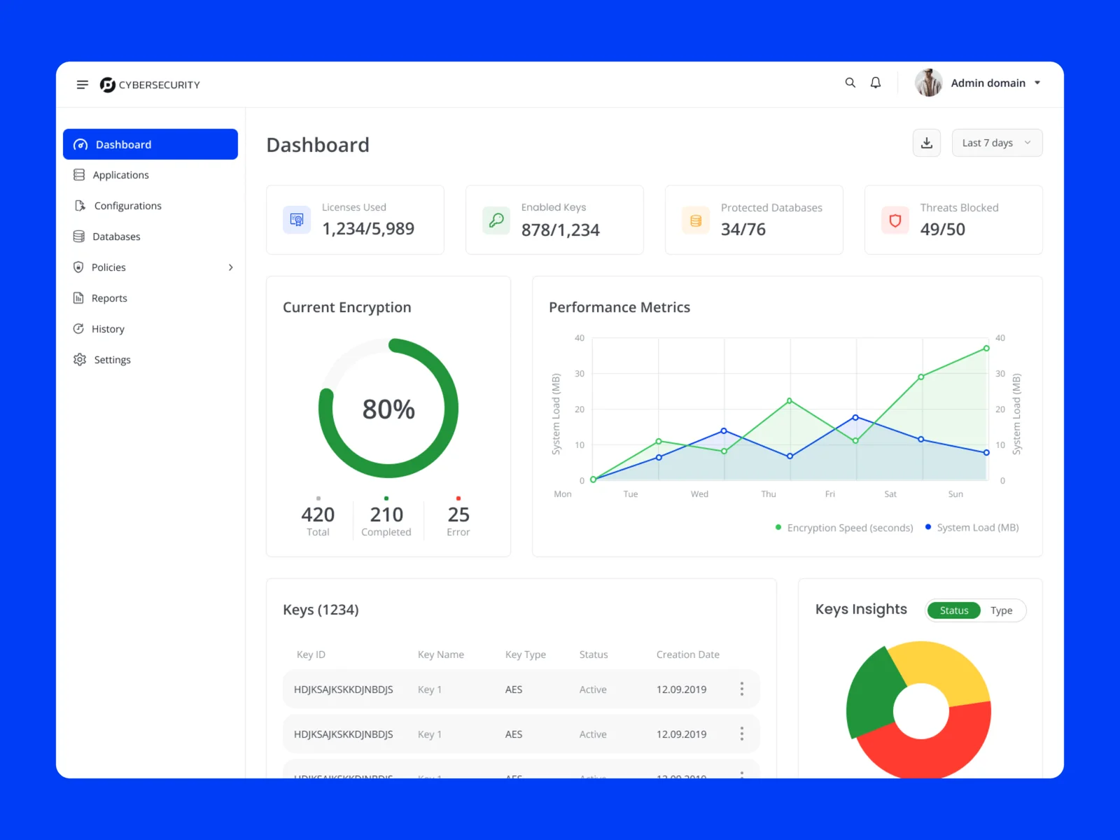
Simplifying search, comparison, and evaluation in a data-heavy real estate platform
This project focused on improving the property discovery experience in a mobile-first real estate platform.
The feature sits at the core of the product: helping users search, explore, and shortlist properties efficiently in a highly competitive and information-heavy domain.
The Problem
Property search platforms often overwhelm users with too much information.
From analysis and research, key issues were:
- Too many listings with little structure
- Time-consuming search and filtering
- Difficulty identifying relevant properties
- Lack of trust in data accuracy
- Low engagement during exploration
Users were not struggling to find properties.
They were struggling to find the right property efficiently.
My Contribution
- Worked on improving the property discovery experience
- Focused on usability, clarity, and flow
- Designed key screens and interactions
- Structured information to reduce user effort
Approach
Understanding
- Reviewed existing property search patterns
- Identified usability gaps in filtering and browsing
- Studied how users explore and compare listings
Designing
- Created structured layouts for property listings
- Improved filtering and discovery flow
- Designed clear visual hierarchy for scanning information
Refining
- Iterated based on feedback and usability observations
- Simplified flows to reduce decision fatigue
- Improved clarity across interactions
Design Decisions
Structured listing experience
Listings were organized so users can quickly scan and understand key details without effort.
Smarter search and filtering
Improved filtering helped users narrow results faster and find relevant properties easily.
Visual-first browsing
Property images and key highlights were prioritized to reduce reliance on heavy text.
Trust through transparency
Important details like pricing and neighborhood insights were made clearer to build confidence.
Supporting deeper exploration
Users could explore properties through virtual tours, insights, and direct communication options.
Final Design
The final experience focused on:
- Faster discovery
- Clear comparison
- Reduced effort in browsing
- Better decision support
Target Users
- First-time home buyers needing guidance
- Property investors comparing multiple options
- Users actively searching with time constraints
Their needs:
- Quick discovery
- Easy comparison
- Reliable information
Outcome
- Cleaner and more structured browsing experience
- Reduced effort in finding relevant properties
- Improved clarity during decision-making
- Better engagement during exploration
Reflections
- Simplifying large datasets requires strong hierarchy
- Visual clarity plays a key role in decision-making
- Discovery products must balance exploration and action